Decisions from data, not gut feeling.
Dashboards that pull together your scattered information into something you can trust to decide each week.
The problem
Your data lives in ten different places: the CRM, the ERP, a few spreadsheets, and the head of whoever keeps the numbers. Getting one reliable figure takes hours, and by the time the report lands it's too late to decide anything.
The problem is rarely that data is missing. It's usually the opposite: there's too much and it doesn't add up. Two systems give different numbers for the same thing, nobody quite trusts the dashboard, and in the end people decide by gut feel just like before you built it.
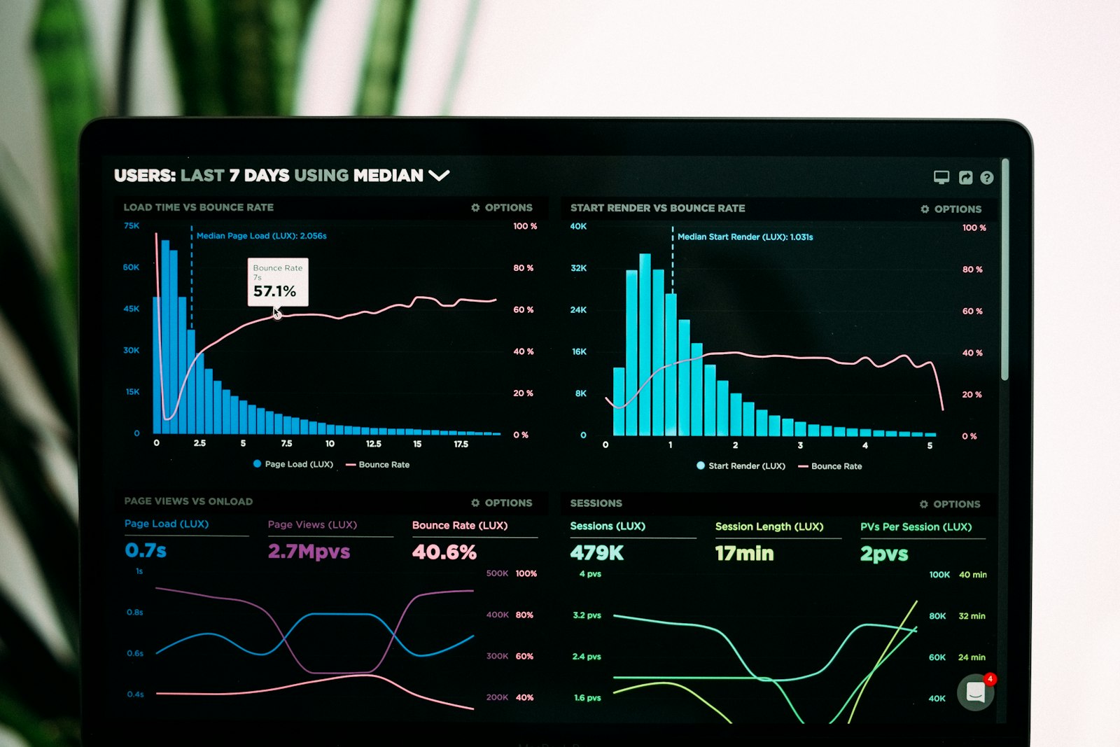
A dashboard that works shows in one thing: every morning you look at a screen, you believe the number, and you know what to do with it. The rest is decoration.
Where AI fits in your data
The most useful part of AI here is the practical bit, not the trendy prediction. You ask in plain language ('how are Madrid sales doing this quarter versus last?') and you get the answer and the chart right away, without waiting two days for someone to pull it by hand.
It also watches for you: it spots when a metric drifts out of normal and flags it before you'd catch it scanning the panel. And it summarizes, turning a dashboard full of figures into two sentences about what changed this week and why.
The limit is the usual one: AI on messy data answers fast and wrong. Before you ask it to interpret anything, the sources have to be joined and the names agreed on. That boring part is still what decides whether the rest is worth anything.
Who's already doing this
Public examples of data done well, not our clients. They show that the pretty dashboard is the tip of a plumbing job nobody sees.


What we actually do
Three ways to go from 'we have lots of data' to 'we make better decisions'.
Custom dashboards
The metrics that actually move your business, in one place and up to date, not twenty charts nobody looks at.
Unifying data
We connect your sources (CRM, ERP, sheets, APIs) into one model where each figure means the same thing everywhere.
Automated reports and alerts
They generate and send themselves, and warn you when something drifts out of normal. No more copy-paste at every close.
How we do it
Define the questions
We start from the decisions you want to make, not from which chart looks nice.
Connect and tidy
We integrate the sources and clean just enough for them to add up.
Visualize and keep it live
We build the dashboard and automate it so nobody has to touch it by hand.
Problems we solve
No visibility
Know the real state of the business at a glance, without requesting a report and waiting.
Manual reports every month
Remove the Excel hours that go into every close reconciling the same thing.
Siloed data that doesn't add up
Join what doesn't talk today so the number stops depending on who you ask.
Questions about data & dashboards
Yes, that's the idea. We connect to your sources as they are (your CRM, your ERP, your sheets, whatever you use) wherever possible, without forcing a stack change or pushing everything into some expensive new tool. The goal is to see your data clearly, not to sell you a migration you don't need.


Want a clear view of your business?
Tell us what you decide each week and we'll build the dashboard around it.